Quiet confidence.
A calm, precise identity. Give the mark and the message room to stand on their own.
AOZO / Visual language
A shared language for every AOZO experience. Grounded in natural materials. Shaped around a clearer way forward.
01 / Brand principles
The AOZO identity is calm, warm, and open. Carry these qualities into every expression of the brand.
A calm, precise identity. Give the mark and the message room to stand on their own.
Sandstone, bronze, and layered mineral textures give AOZO a grounded, human character.
The open circle connects human intent and intelligence: distinct, balanced, and always open to what comes next.
02 / Color
Sandstone is the canvas. Charcoal carries the information. Bronze and gold create moments of emphasis, with room around them.
#F2EEE8The foundation of the palette.
#D6C7B3Soft contrast and natural depth.
#A8754BDisplay emphasis and brand detail.
#2C2C2CClear typography and dark backgrounds.
#7A7772Supporting detail; check contrast at small sizes.
#C8A15ALight, mineral veins, and restrained highlights.
Use charcoal for small text on sandstone and sandstone for text on charcoal backgrounds. Bronze is for large display accents; gold is decorative. Check every text and background pairing. Metallic Gold is a digital approximation; physical finishes need a matched production sample. Logo files retain their original artwork colors.
03 / Typography
Two complementary voices: Newsreader gives headlines their editorial character; Geist brings clarity to supporting information.
Newsreader / Display
Every source.
One door.
Use for expressive headlines. Keep line breaks deliberate, spacing close, and emphasis upright in warm bronze.
Geist / Supporting voice
A clearer view of
what comes next.
Keep body copy short and direct. Use weight and space to create a calm, readable hierarchy.
Geist Mono / File formats, color values, and technical references.
04 / Composition & material
An open circle becomes a passage. Layered stone gives it substance. Fine veins of gold catch the light without taking over the page.
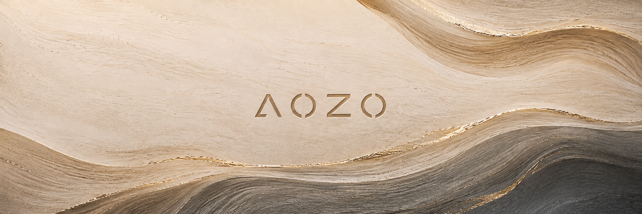
Balance the mark and message against a single expressive form. Keep the composition spacious and the focal point clear.
Use mineral layers to give the brand depth. Keep typography on calm surfaces and leave clear space around the mark.
Use soft, directional light and fine metallic highlights. Preserve the natural character of the stone without overpowering the identity.
05 / Brand assets
Official SVG and 1024 px-wide PNG files. Wordmarks and stacked logos have transparent canvases; symbols include their intended avatar backgrounds.




Keep the mark distinct from text, edges, and other identities. Check its legibility at the final output size.
Use the supplied light or dark artwork for its intended surface. Choose monochrome when color or texture reduces clarity.
Do not stretch, rotate, recolor, outline, or rearrange the mark. Use the original files and preserve their proportions.